


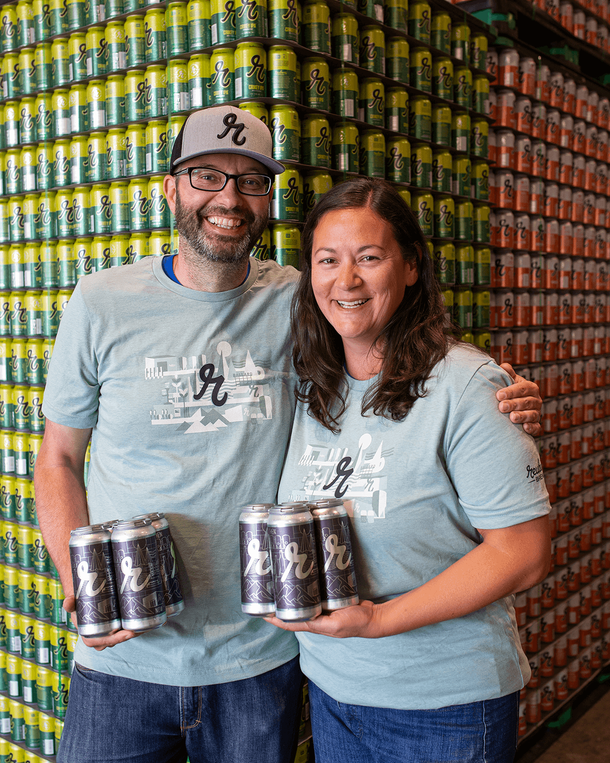
Giving the brewery its own 7th “birthday” present
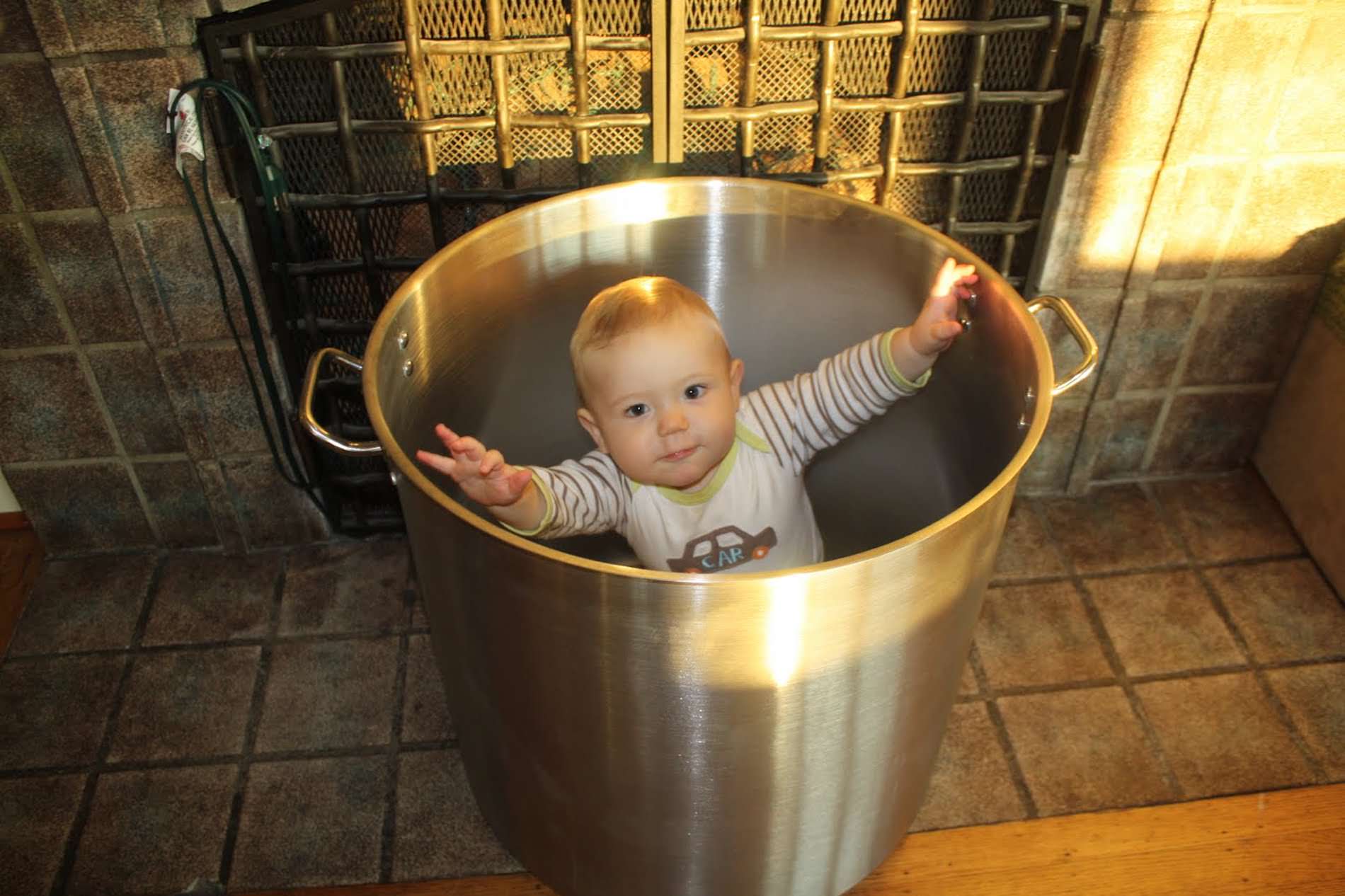
It’s crazy to think that Grace and I started the Reuben’s Brews journey back in 2010 shortly after our first born son, Reuben, was born. I quickly caught the brewing bug after Reuben and Grace bought me a homebrew kit, and took to entering tons of homebrew competitions. I attended an intensive course at UC Davis, and read every book I could on the subject of brewing. We were also fortunate to get the opportunity to pour at a neighborhood beer festival as homebrewers in November 2010. In the run up to the event, we were told that we needed to have a name for the “brewery” by the next day – as they were about to print the programs for the event. Grace and I had that one night to think of names, and we decided to call ourselves Reuben’s Brews, as Reuben was the catalyst for me to start brewing.
After winning the People’s Choice at that festival back in November 2010, I continued to learn as much as I could and entered competitions to get unbiased feedback on our beers. We opened as a professional brewery on August 5th, 2012 in Ballard, at 1406 NW 53rd St. We were the first brewery east of 15th and north of Leary to open. Little did we know that this corner of Ballard would soon be home to more than 6 breweries in a few short years! Grace’s friend Amanda created our original logo back for that November 2010 festival. When we opened commercially, this original was freshened up but still stayed true to the 2010 original. When we released bottles for the first time in 2013, and then cans for the first time in 2016, we created a unique design which featured the r in our full logo, which has been our primary logo for the past few years.
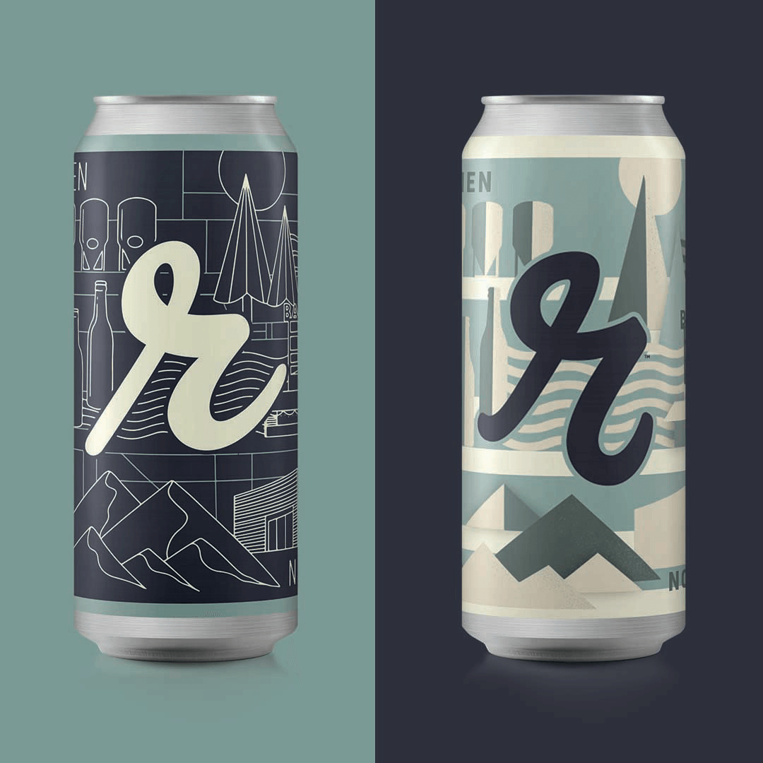
One of our biggest strengths is the number of different beers we brew. We are continuously reinventing our beer lineup, always innovating, always refining. In 2018 we brewed over 140 different beers! We felt it was time, as we reach our seventh anniversary, that our packaging and logo better reflect who we are as a brewery. We want our packaging to be as innovative as the beer inside. And while for us, the beer has been – and always be – our top priority, we felt how the cans looked on the outside could be improved a little.
You’ll notice subtle changes to our ‘r’, which has more energy and verve, and is more balanced than our prior ‘r’. But it is still very consistent with how it used to look – some people may not even notice the difference! If we’ve done it right, it should look like a natural progression – a refresh of our designs, rather than something totally new. The goal of our refresh was to subtly update our design. Our logo too has been freshened up, with more emphasis on our son’s name than the industry we are in.
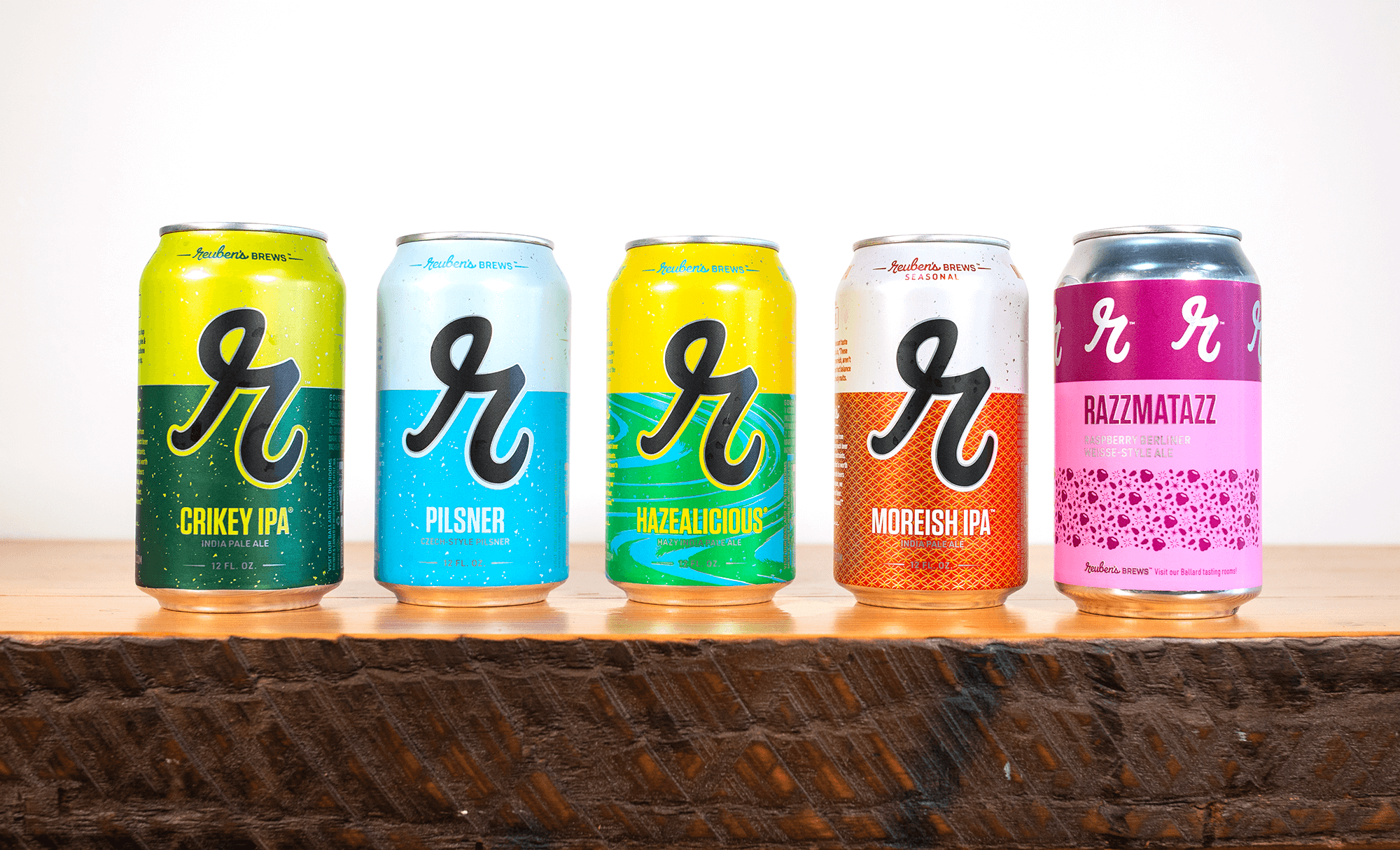
We worked with the awesome designers at Top Hat in Pittsburgh on these updates, who I can’t recommend enough. Our cans have been updated to include more information about who we are and what we believe in, as well as all of the important information about the beer you’re about to enjoy. The designs better reflect the open-minded, Beer Unbound philosophy that underwrites everything we do at Reuben’s Brews. Our ‘r’ is still the predominant feature on the cans though of course!
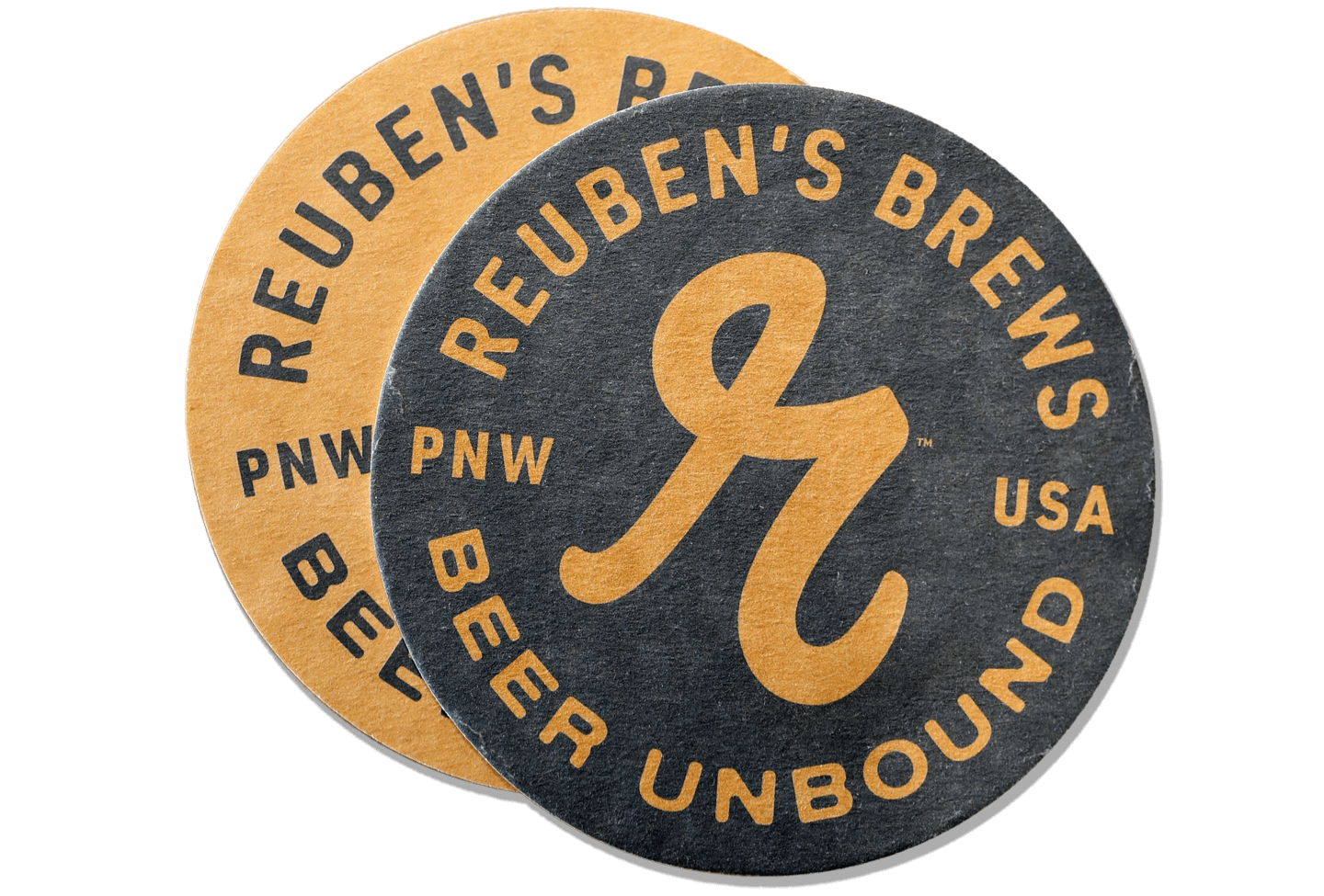
You will notice, next time you’re in the tasting rooms, updated glassware, merch, coasters, and much more. All of these items will reflect this same philosophy and our story as a whole. We are a small, family-owned and run brewery with a commitment to brewing beer the best we know how. And we want your experience with our beer to be the best it can be as well.
Thanks for your support over these amazing first 7 years, and cheers to the future!